Bureau is a design studio driven by the promise of purpose and the pursuit of practicality.
Enquiries. Should we be working together? Drop us a call or an email and someone will be in touch!
(Notes on) Selected Works 2009—2024 › The Boathouse Pulau Tioman
Brand Identity Design
The Boathouse Pulau Tioman
We are thrilled to embark on an exciting journey with The Boathouse Pulau Tioman, a picturesque beach resort nestled in the heart of paradise. Our mission is to craft a brand identity that captures the essence of this enchanting destination, blending luxury with laid-back island charm. Drawing inspiration from the pristine beaches, azure waters, and lush tropical surroundings of Pulau Tioman, we set about working to deliver a cohesive brand experience that resonates with guests and encapsulates the resort’s unique character.
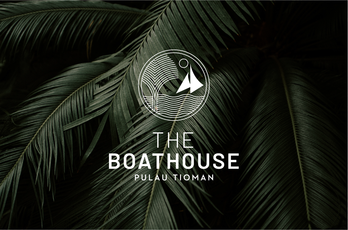
Our mission is to craft a brand identity that captures the essence of this enchanting destination, blending luxury with laid-back island charm.
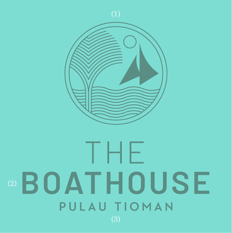
Brandmark
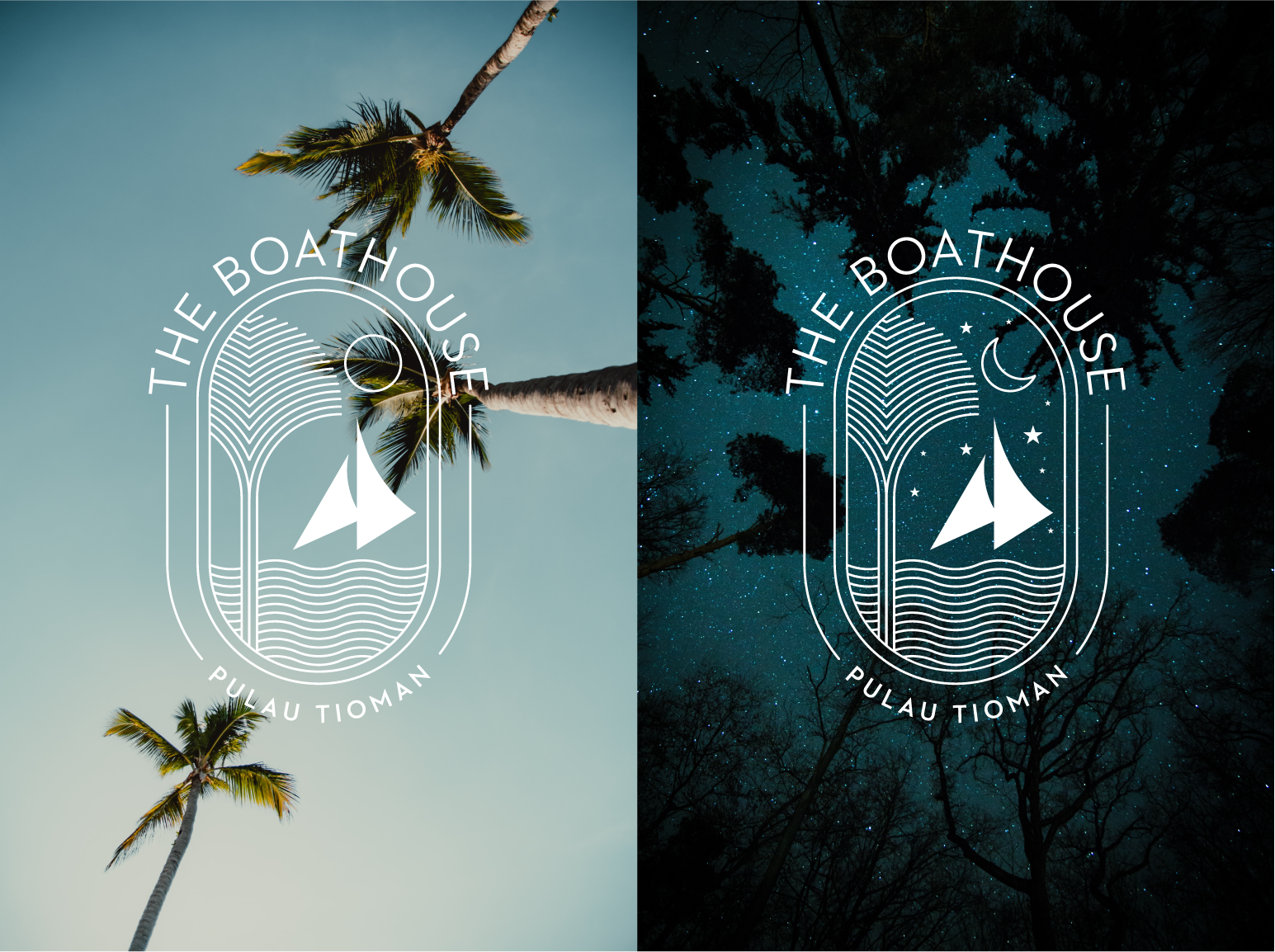
(1)—The logomark presents the idyllic
scene of the traditional Malay Jong
racing by the shore. Through the port
window the Nipah Palm features
prominently as a nod to the location
name of Kampung Nipah.
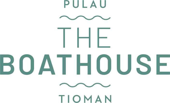
(2)—THE BOATHOUSE wordmark,
set in Barlow.
(3)—PULAU TIOMAN location name,
set in Neutraface 2 Display Bold.
Visual Elements
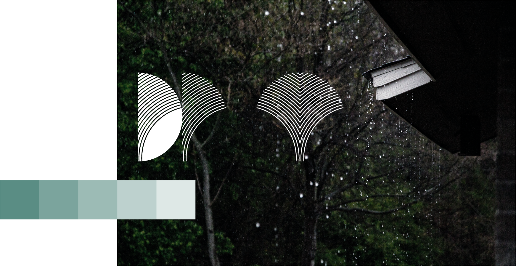
Simple graphic forms and elements combine with visually arresting images draw inspiration from the island’s natural bounty—lush palm leaves sway gently in the breeze, azure waters shimmer with inviting allure, even the tropical afternoon shower evokes a sense of serenity.
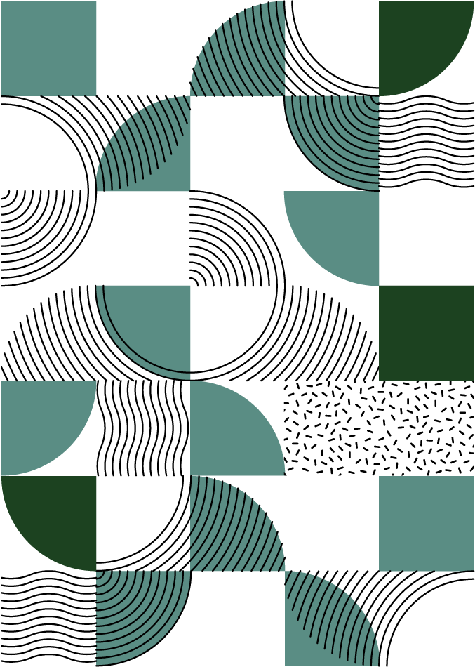
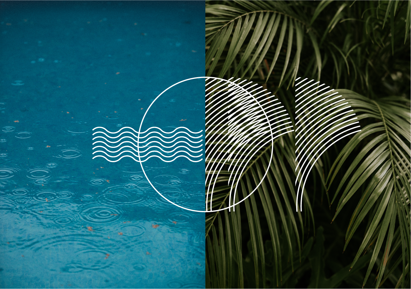
By employing a range of brand devices alongside the main logomark, a brand can maintain consistency while maximizing visibility and impact across a multitude of channels and touchpoints.
Brand Devices
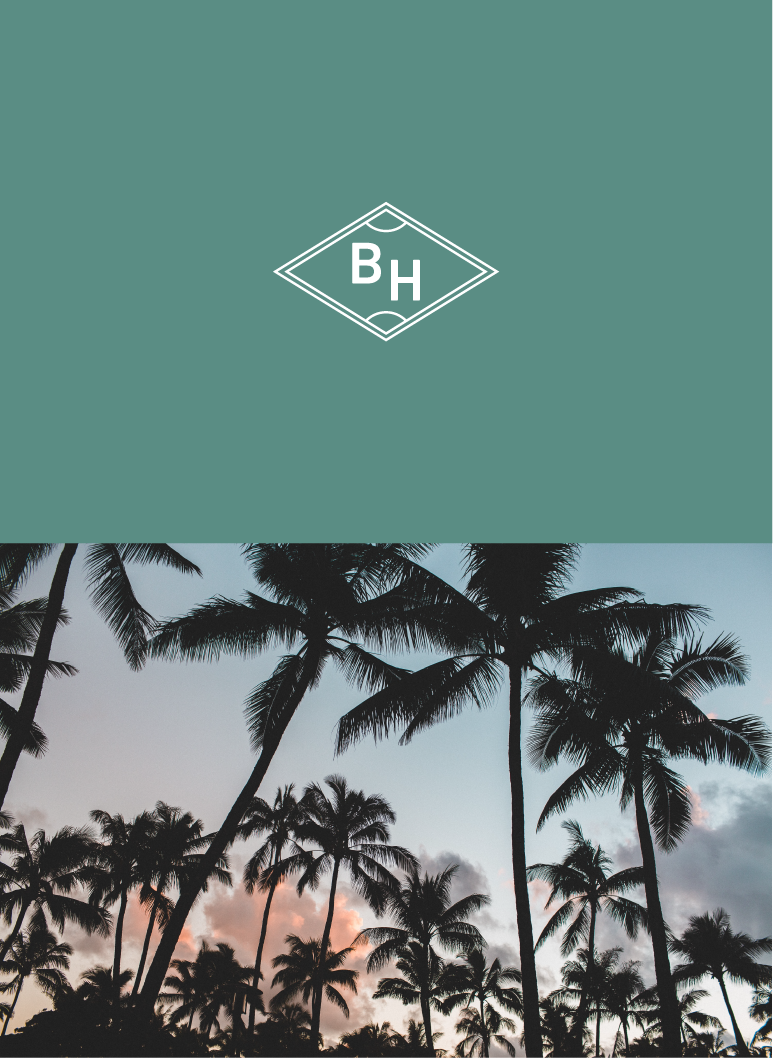
In today's dynamic digital landscape, a singular logomark may not suffice to effectively represent a brand across diverse platforms and contexts. Secondary logos offer versatility, adapting to various applications without compromising brand recognition. Visual shorthand, such as wordmarks or abbreviated versions of the logo, provide a concise yet recognizable representation ideal for social media profiles and smaller spaces. By employing a range of brand devices alongside the main logomark, a brand can maintain consistency while maximizing visibility and impact across a multitude of channels and touchpoints.
Brand Colours
The brand’s color palette draws direct inspiration from the breathtaking vistas of Tioman Island. For example, hues of emerald and turqoise reflect the tranquil azure waters surrounding the island and the clear blue skies, while lush forest greens echo the verdant rainforests that carpet its interior. These colors not only capture the natural beauty of Tioman but also embody the island’s spirit of serenity, adventure, and tropical allure, infusing the brand with a sense of authenticity and connection to its idyllic surroundings.

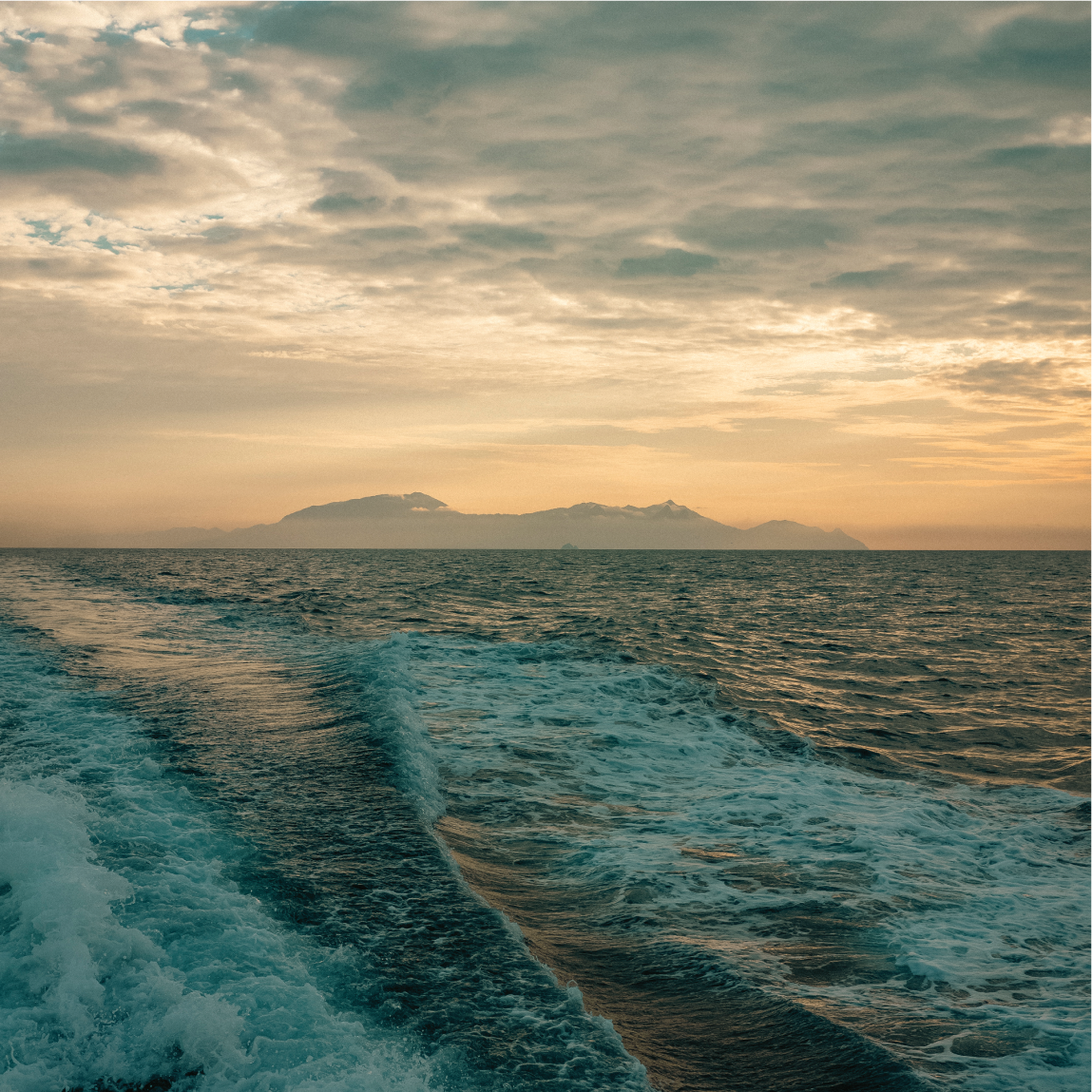
Building an island resort presents formidable challenges, as everything must be transported by sea. Construction progresses sluggishly, compounded by monsoon delays extending work for months. Despite setbacks, anticipation mounts, for the remote locale promises an exclusive retreat, far removed from bustling city life. The resort’s eventual unveiling, nestled amid azure waters and verdant landscapes, ensures a tranquil haven well worth the toil and wait.

About Us
Byline—Bureau is the official website of Bureau Private Limited. Headquartered in Singapore, our work includes, but is not limited to: Brand Identity Design, Packaging Design, Editorial Design, Exhibition and Event Space Design and Strategic Planning. We think the expression “no sweat” is a hate crime.
Subscribe
Get access to latest news and all the features by subcribing here.
BUREAU OFFICIAL WEBSITE ©2022. BUREAU PTE LTD.