Bureau is a design studio driven by the promise of purpose and the pursuit of practicality.
Enquiries. Should we be working together? Drop us a call or an email and someone will be in touch!
(Notes on) Selected Works 2009—2024 › Wonderlit
Brand Identity Design
Wonderlit
Of what value is education and literacy if not to understand and express emotion?
Wonderlit is a creative enrichment space that offers a boutique experience tailored to nurture and develop children through their formative years to become confident communicators.
Some might call it “intellectual curiosity” and some might, whimsically, refer to it “a sense of wonder”, it’s what spurs learning, and it is wildly pleasurable. Bureau’s design approach for Wonderlit intends to inspire a sense of wonder and put a smile to anyone who walks into the learning space.
Sometimes curiosity leads to chance discoveries, like when the team at Bureau came upon an A to Z list of complex human emotions and expressions. There it was, the basis for the entire project. It’s about connecting education and humanity, literacy and emotion.
The Wonderlit brand identity is inspired by the range of rich and often complex emotions and expressions that help bring a story to life.
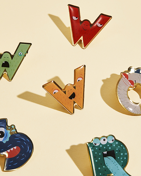
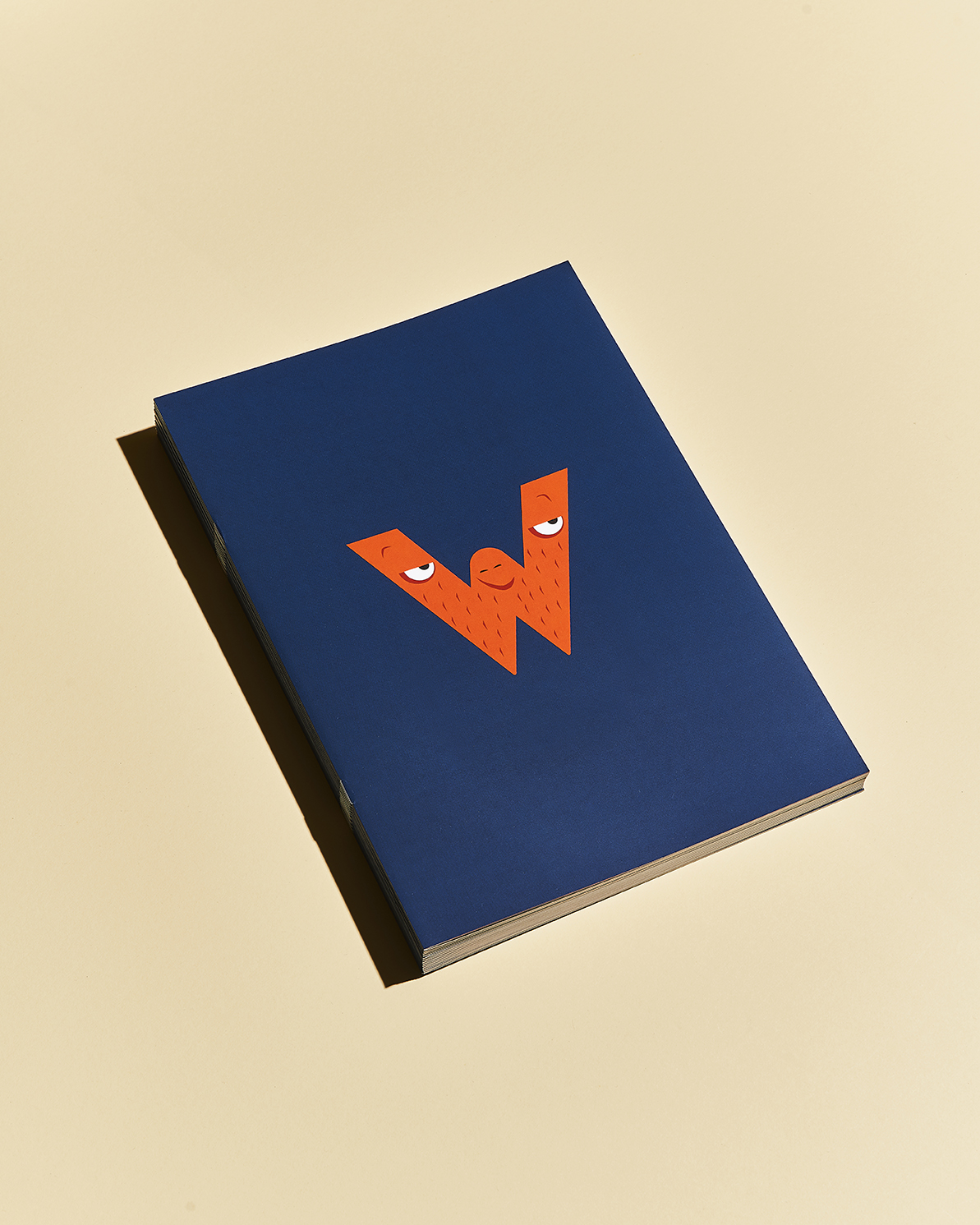
This inspired a series of illustrations of alphabetical characters, each representing and bearing a different emotion or expression. Here is an initial collection of 26 but the possibilities for expansion is huge.
The Wonderlit logo has a special version that is made up of all illustrated alphabet creatures. A slightly pared down version is used more commonly for the centre’s many practical applications.
We took a design approach that allows us to inspire the same sense of wonder and put a smile to anyone who walks into the learning space.
The Wonderlit Master Logo is also known as the Wonderlit Wordmark. It is from here that several other brand devices have been created to ensure brand visibility across multiple digital platforms.
1. ‘W’ Brand Mark
2. Wonderlit Wordmark
3. Wonderlit Wordmark Kosong
4. Social Media Avatar
5. App Icon
6. Pencil Signature
The Wonderlit master logo in the curiously named ‘dispute room’. The designers at Laank did a fantastic job in dreaming up the Wonderlit space at its Orchard Road premises.
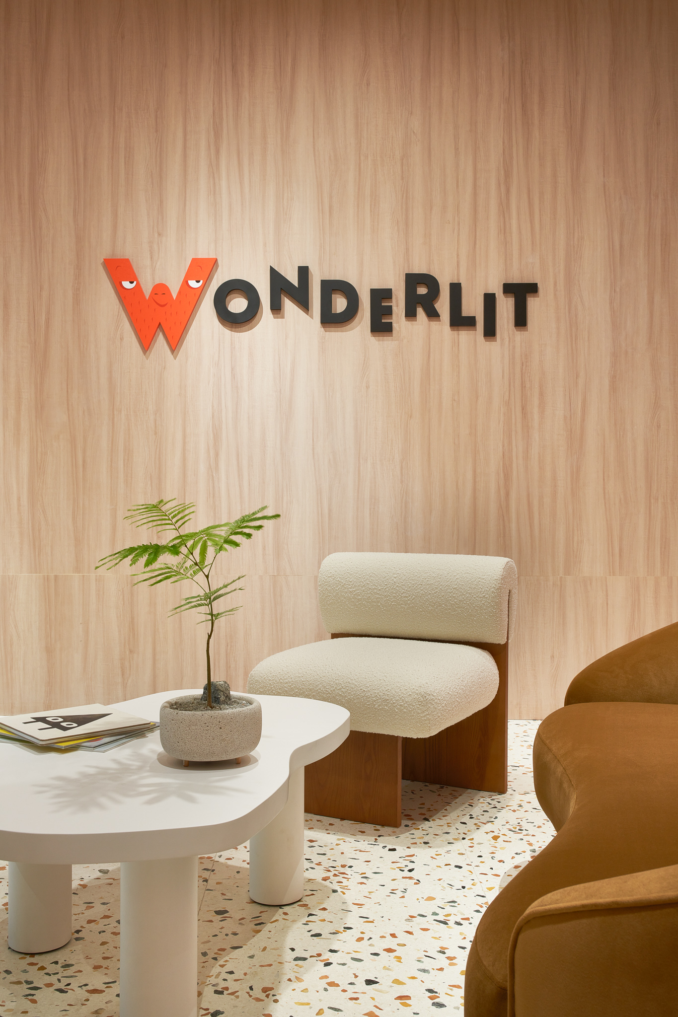
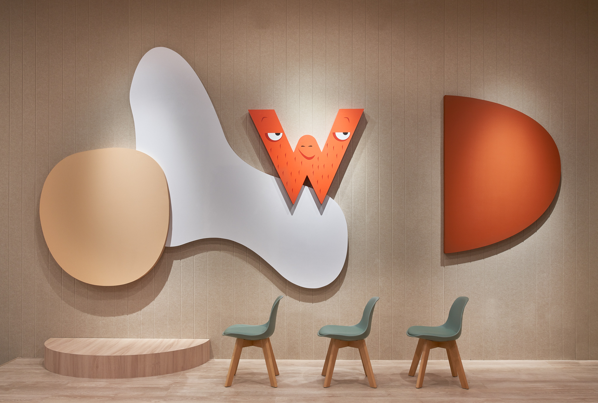
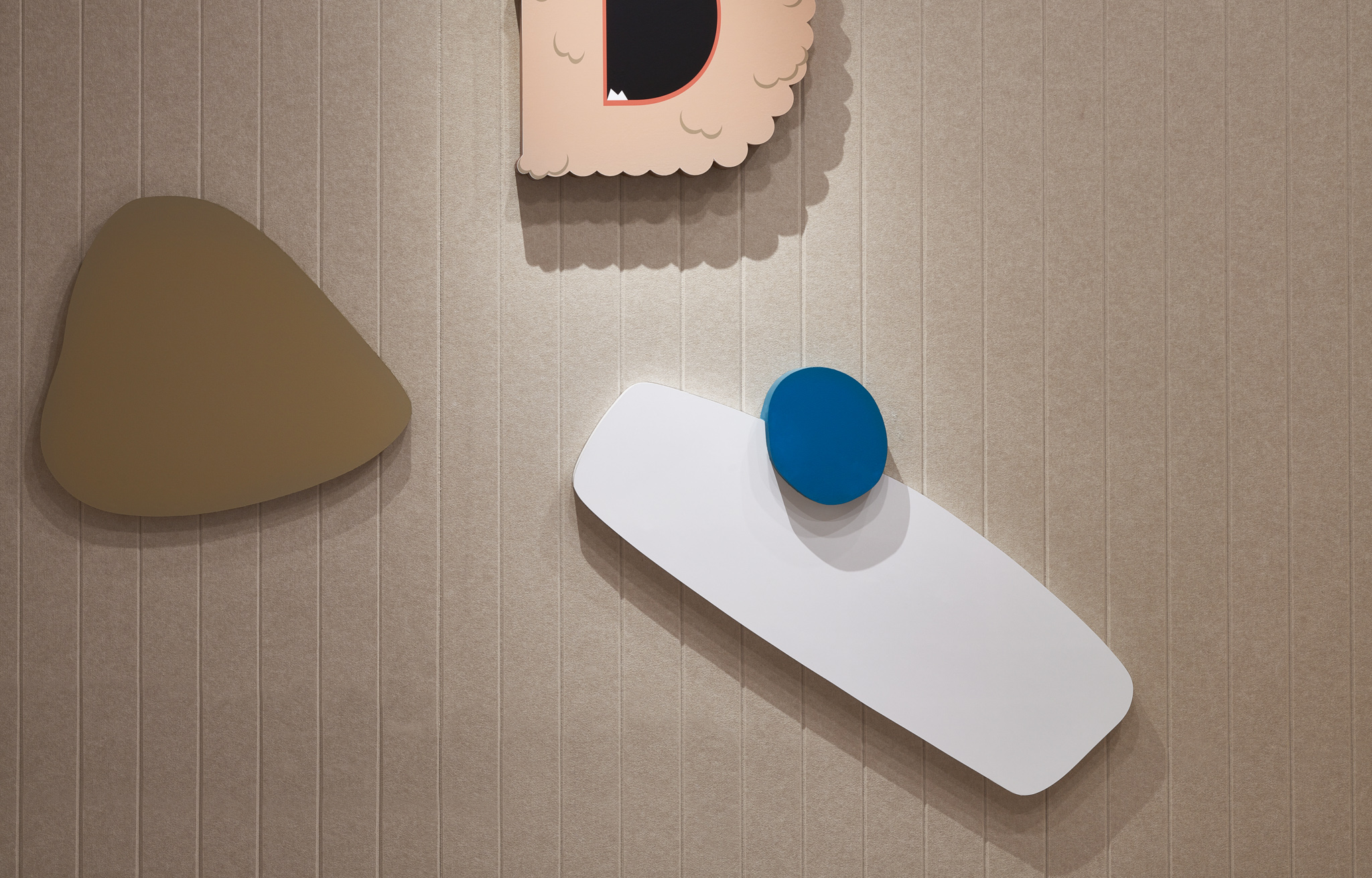
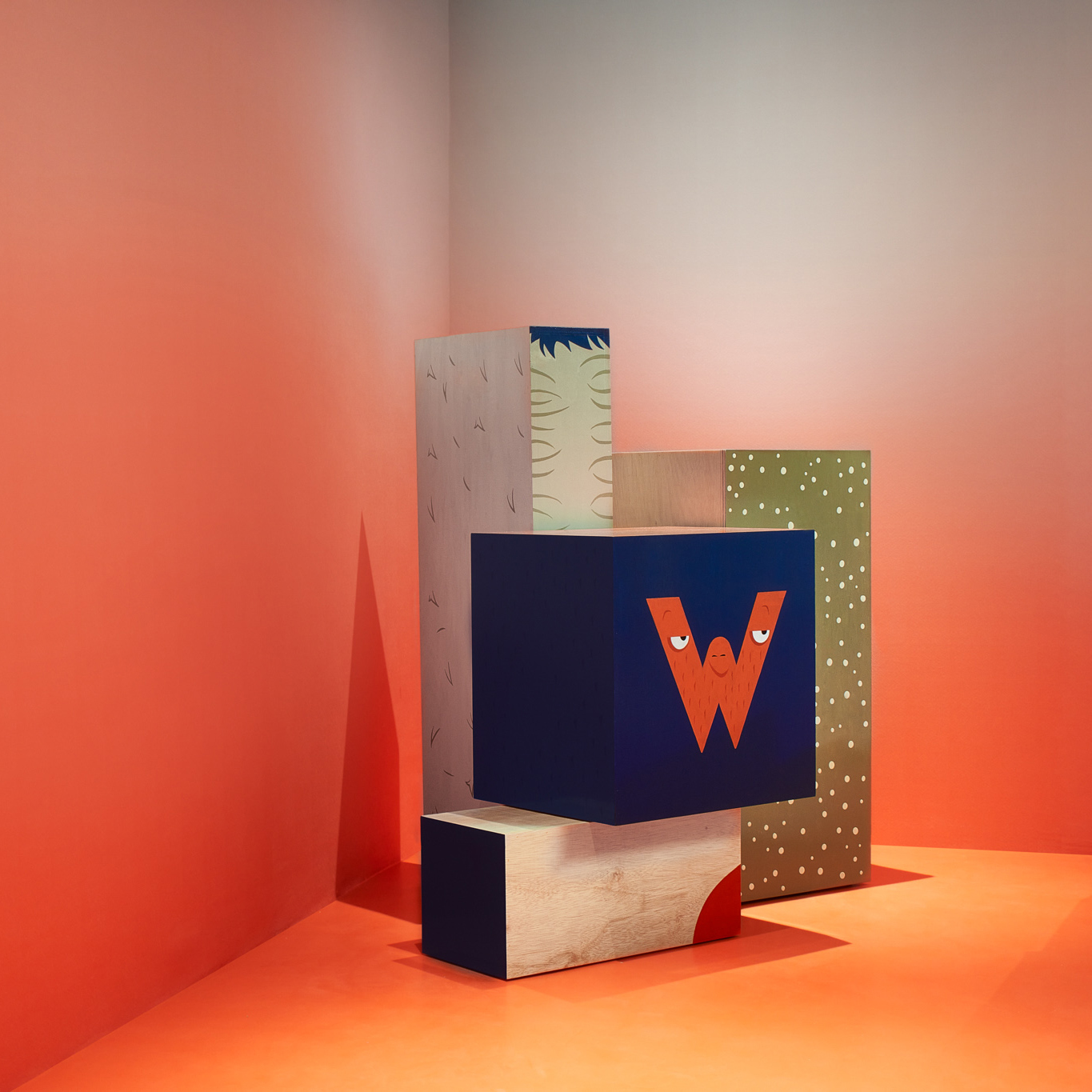
Handpainted giant alphabet blocks by @oldworld_charm. The collaboration gave a charming, human quality to the project. For 3 weeks we turned the Bureau meeting space into a sign painting studio. Process pictures coming soon.
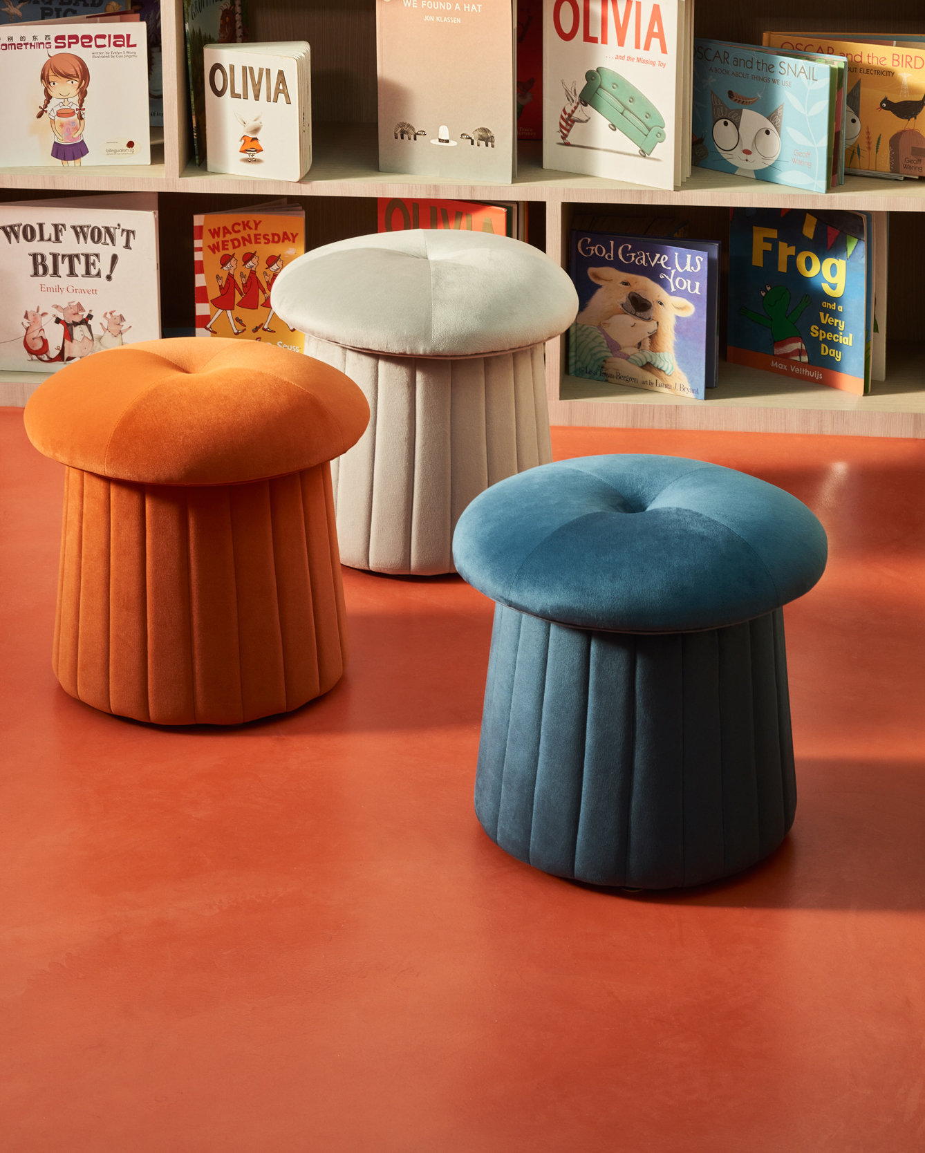
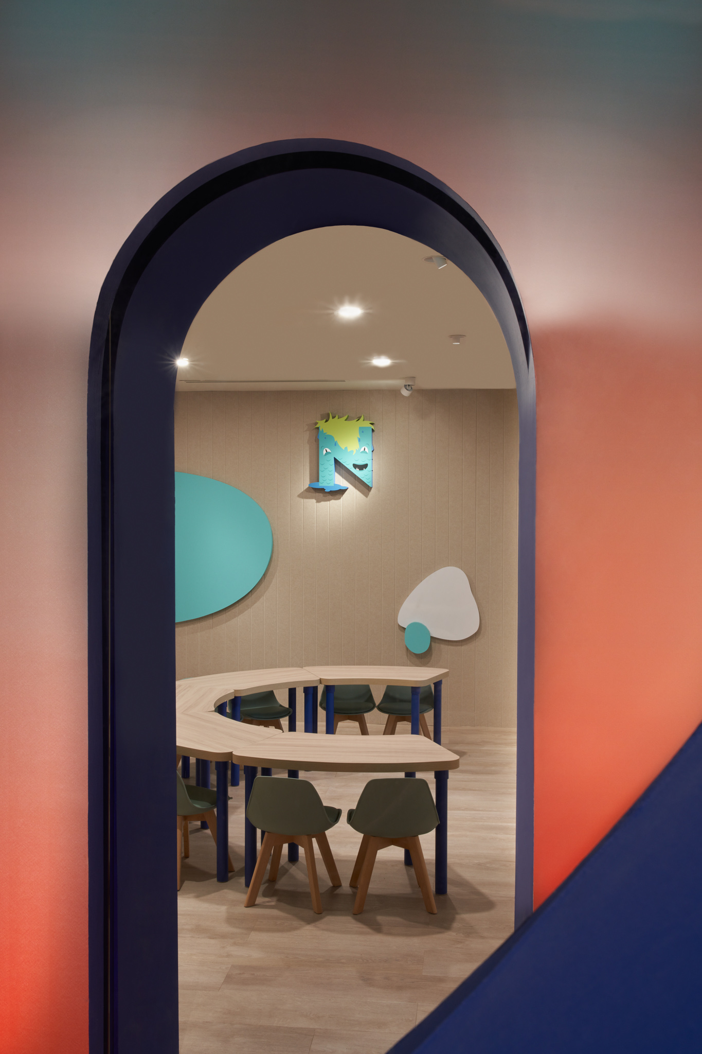
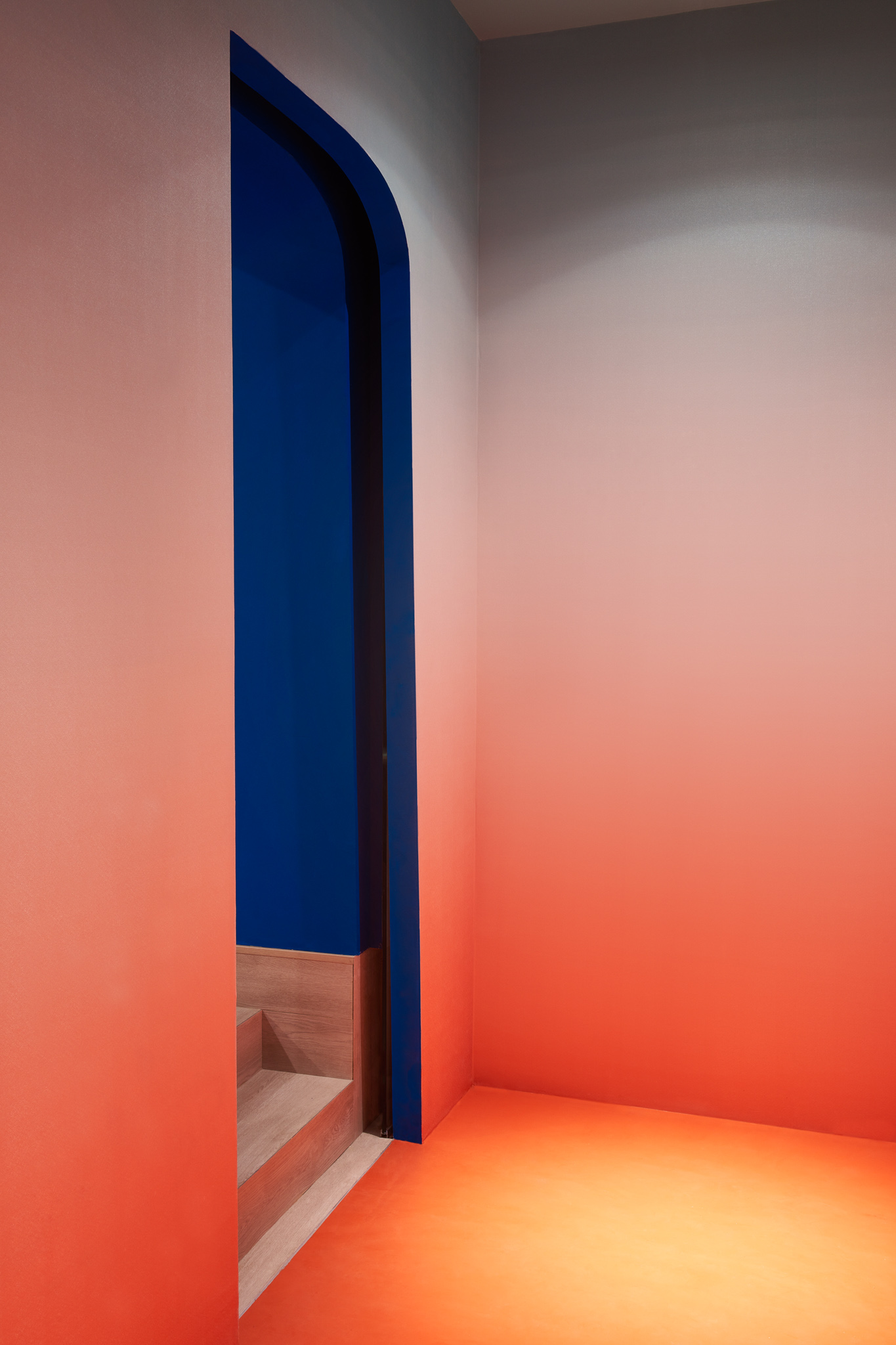
Laank’s bold use of brand colours turned the spatial experience into surreal, whimsical world. A favourite feature? The epoxy floor screed, colour matched to the brand’s main colour Pantone 7417.
From where the floor meets the wall, a custom printed wall paper continues on, in a gradient tone that turns from Dusty Salmon to Fresh Mint as it rises towards the ceiling.
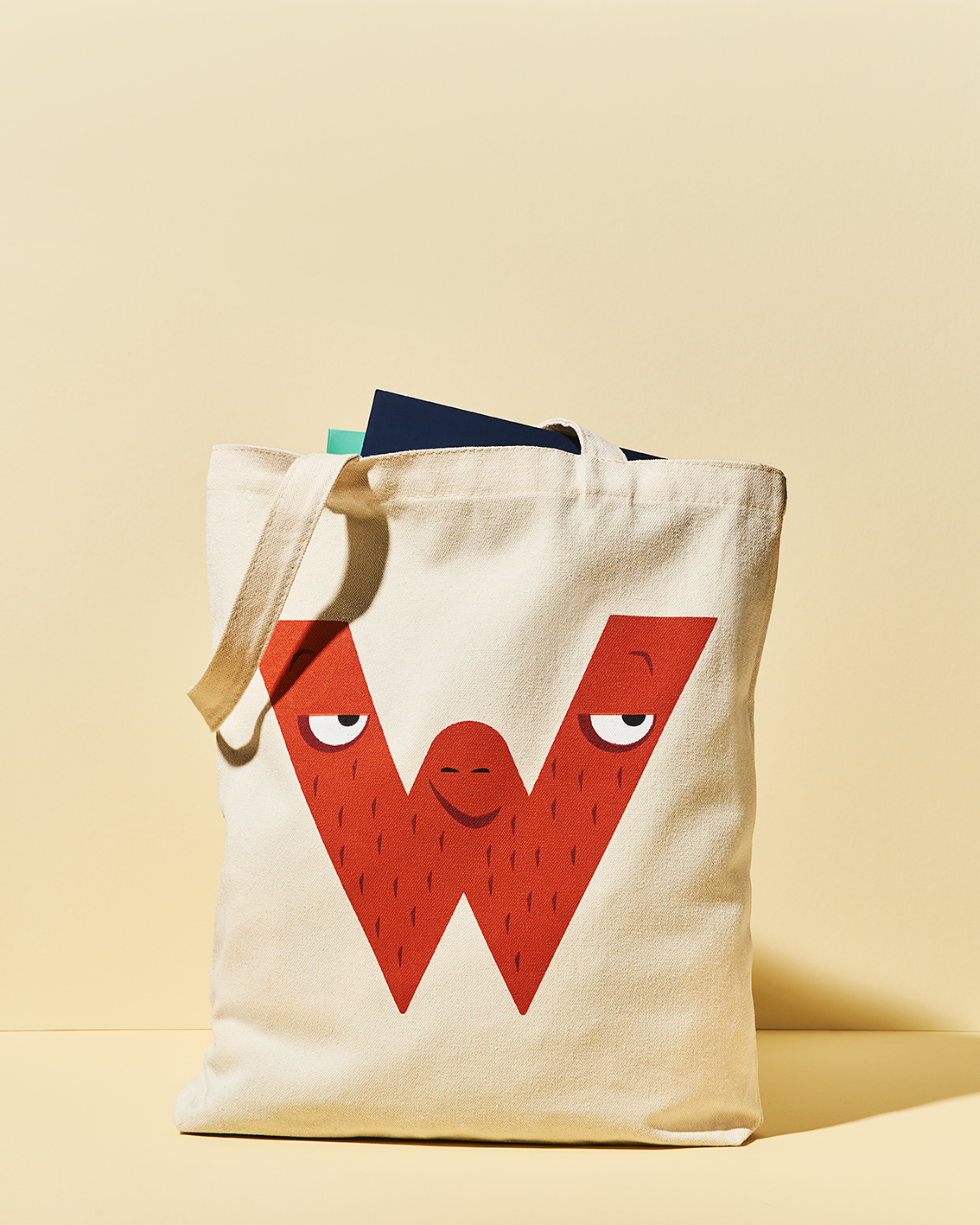
Fun merch ideas that kids could take home! Here a tote bag and a range of collar pins. The collar pins are also worn on the teachers’ lab coat uniforms.
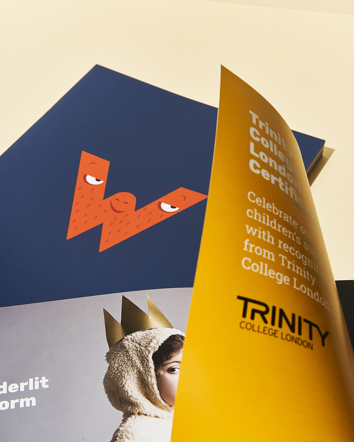
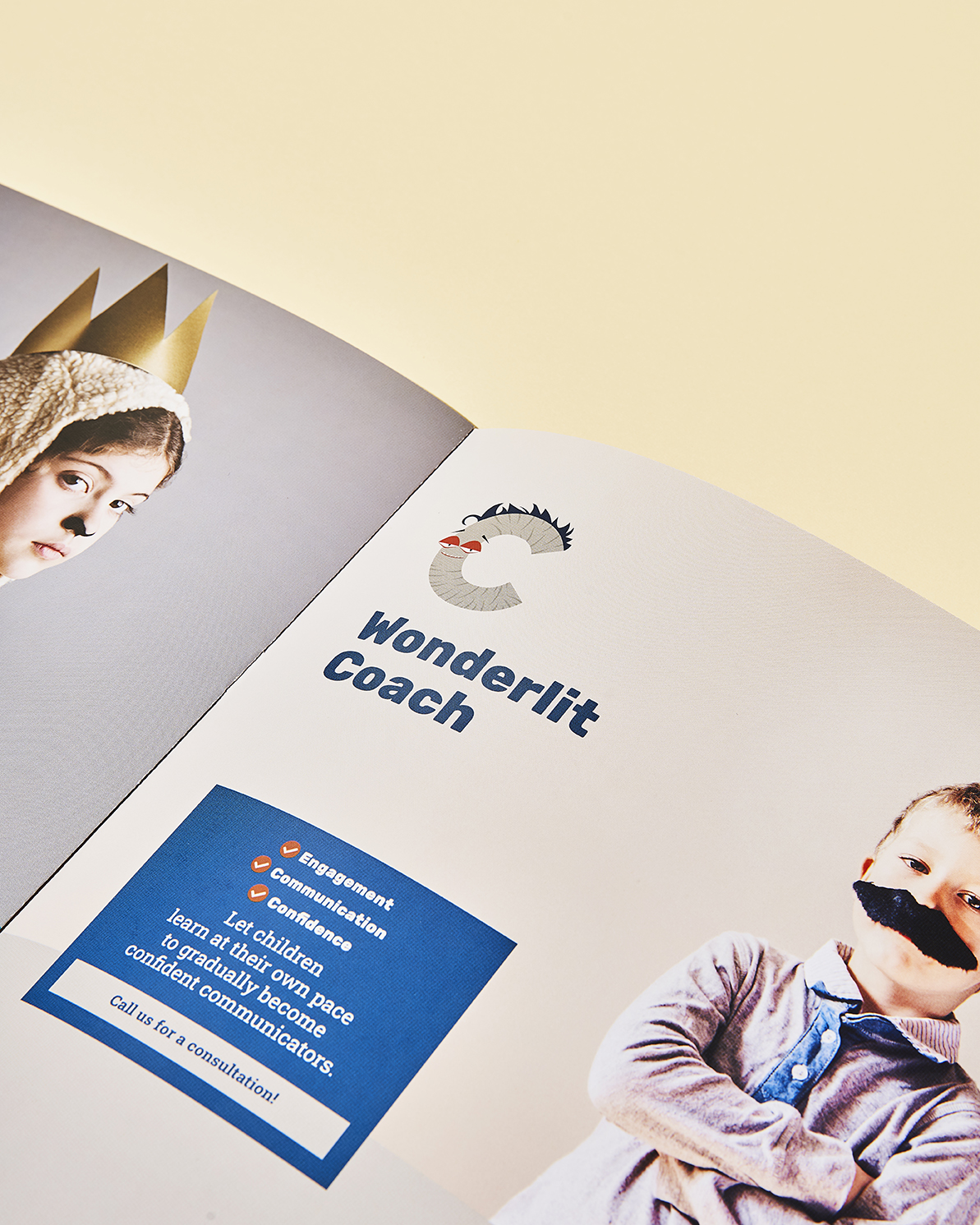
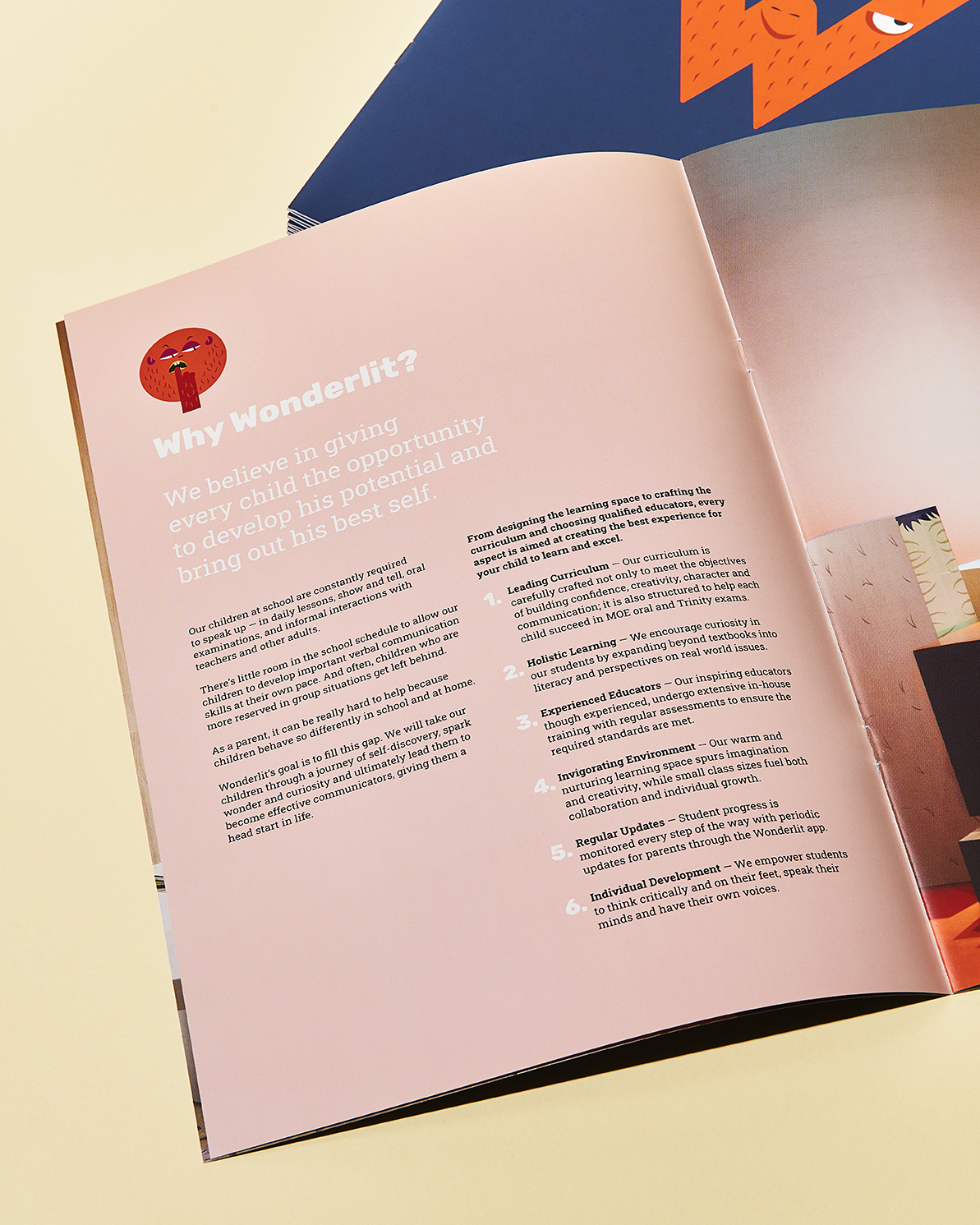
Printed brochures. Remember the ubiquity of them?
Client: Wonderlit Education Centre
Creative Director: Kai Yeo
Designers: Anthony Lew / Weiqiang Neo / Edna Sun
Project Coordinators: Serene Wu / Seck Luan Lim
Illustrators: Anthony Lew / Weiqiang Neo / Edna Sun / Charmaine Chen (@oldworldcharm)
Photographers: Benny Loh (Studio Zeroes) / Ryan Loh
Share on Facebook | Twitter | Instagram | Tik Tok
About Us
Byline—Bureau is the official website of Bureau Private Limited. Headquartered in Singapore, our work includes, but is not limited to: Brand Identity Design, Packaging Design, Editorial Design, Exhibition and Event Space Design and Strategic Planning. Sometimes we take walks in the jungle to ponder words that rhyme with “orange”.
Subscribe
Get access to latest news and all the features by subcribing here.
BUREAU OFFICIAL WEBSITE ©2022. BUREAU PTE LTD.