Bureau is a design studio driven by the promise of purpose and the pursuit of practicality.
Enquiries. Should we be working together? Drop us a call or an email and someone will be in touch!
(Notes on) Selected Works 2009—2024 › H—Paper
Editorial Design / Magazine Identity
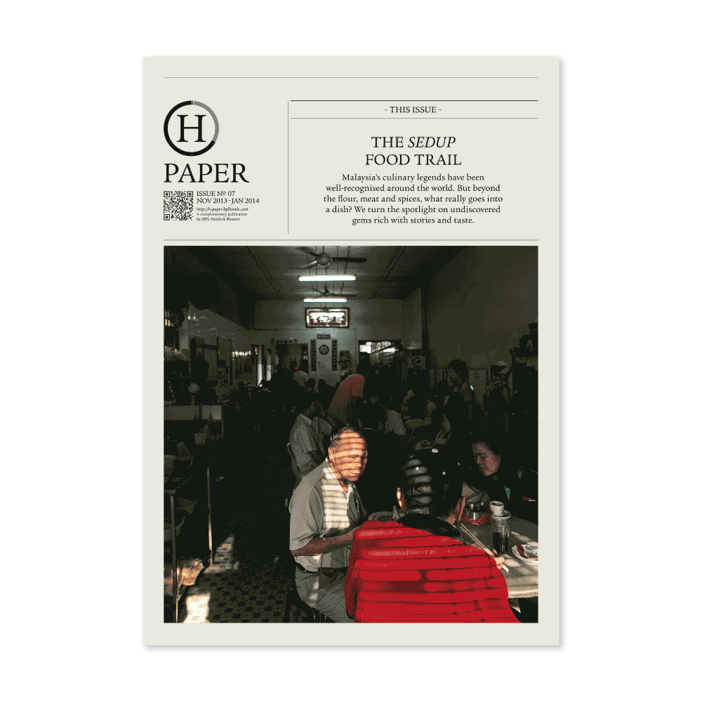
H—Paper
Revitalizing a publication identity after a global pandemic.
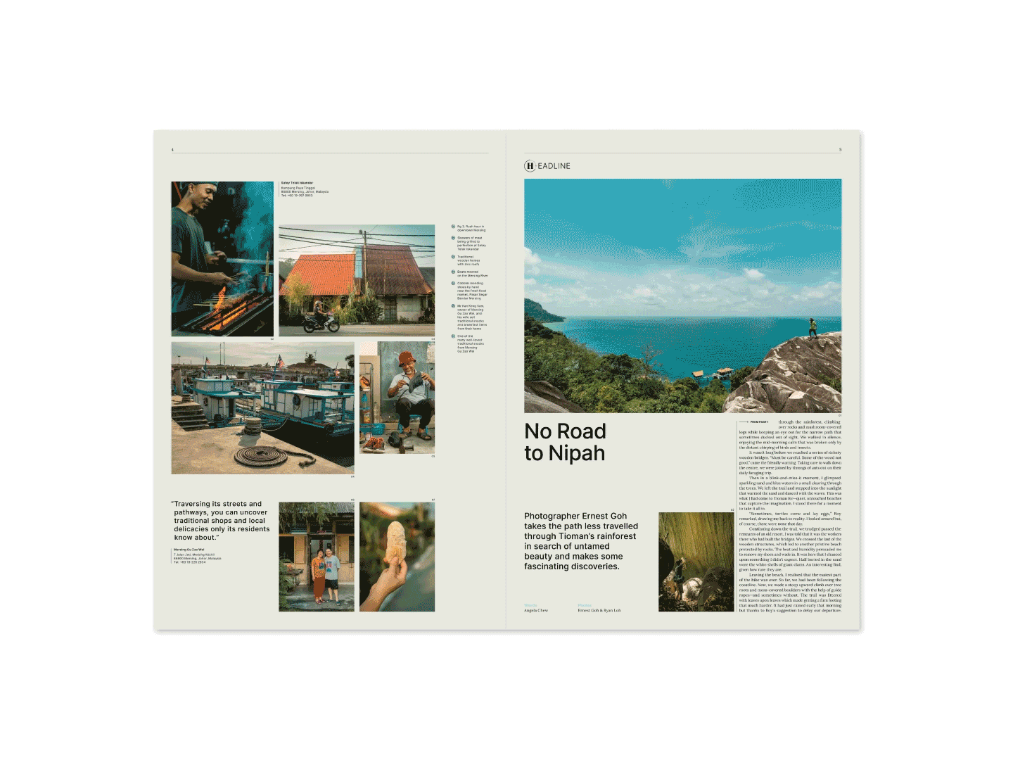
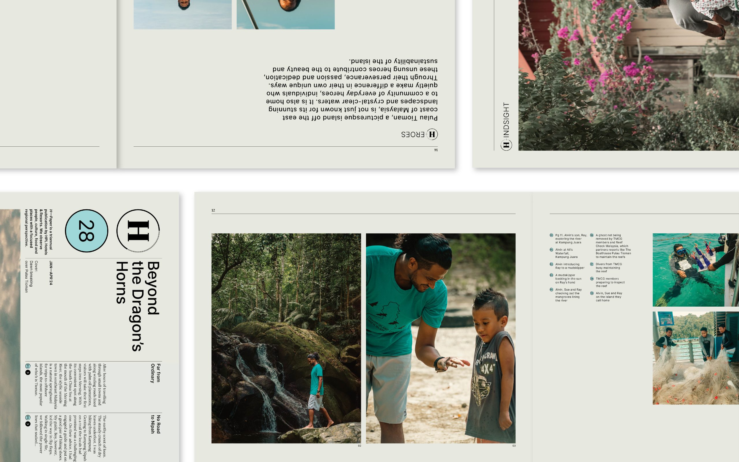
The first issue of H—Paper was launched in 2012 by HPL Hotels & Resorts. In each issue, the team visits one of the 12 destinations in which HPLs’ properties are located. The publication aimed to cover topics about the people, culture, food, and places with a focused regionalist perspective.
The global COVID-19 pandemic and its aftermath have put forth unprecedented challenges, but we saw it as a welcomed opportunity for a refreshed look. The brand refresh aims to bring forth a sense of familiarity while introducing a sleeker and more refined aesthetic, which not only works on print but also incorporates screen and web-friendly fonts catering to the change in user patterns.
The brand refresh aims to bring forth a sense of familiarity while introducing a sleeker and more refined aesthetic.
The Refresh
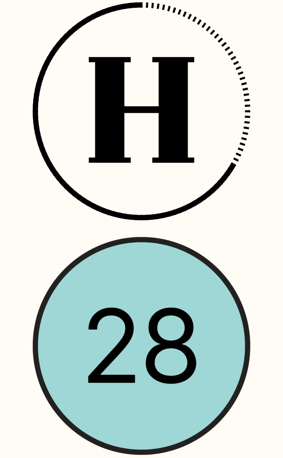
The refreshed H Roundel changes the proportion of the ‘H’ and the circle around it, making it sleeker while bringing the focus to the carefully crafted ‘H’.

Creating a Visual Countdown
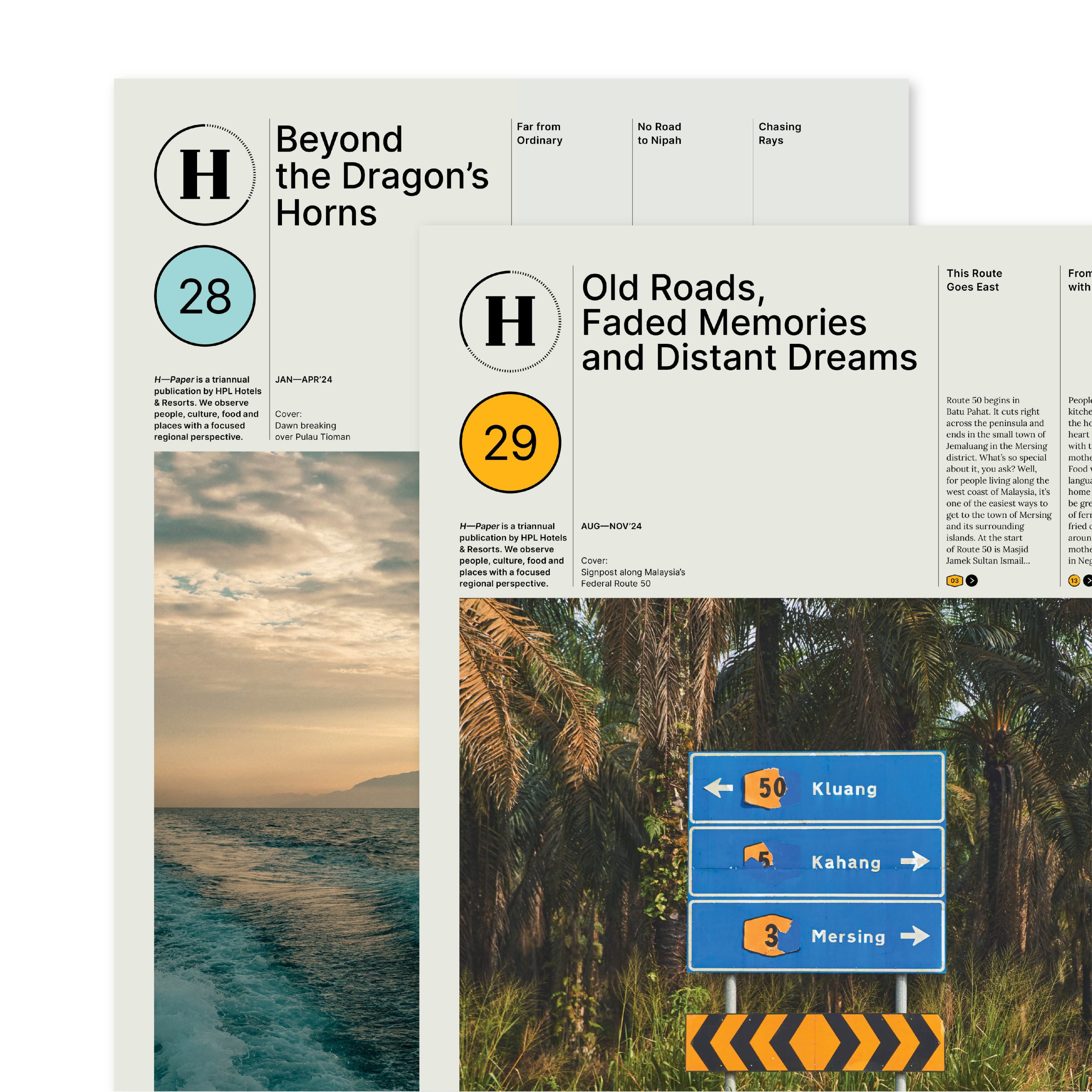
As a triennial publication, the H Roundel will visually countdown the year with a slightly different outwearing with each issue of the year.

The New Masthead
The new masthead does away with the word paper and pairs the roundel with a number enclosed in a colours circle, which indicates the issue number. The colour circle will be determined by the theme/location the issue is based on.
H—Paper was created over a decade ago as an in-house cultural and lifestyle publication for guests of HPL Hotels & Resorts.
Typography
INTER—A variable font family carefully crafted and designed for computer screens. It features a tall x-height to aid in the readability of mixed-case and lower-case text. The font is mainly used for headlines, headers, stand-first, quotes, and captions.
LORA—A well-balanced contemporary serif, it has moderate contrast well well-suited for body text usage. It is optimised for screen appearance as well as working well for print usage.

Section Headers
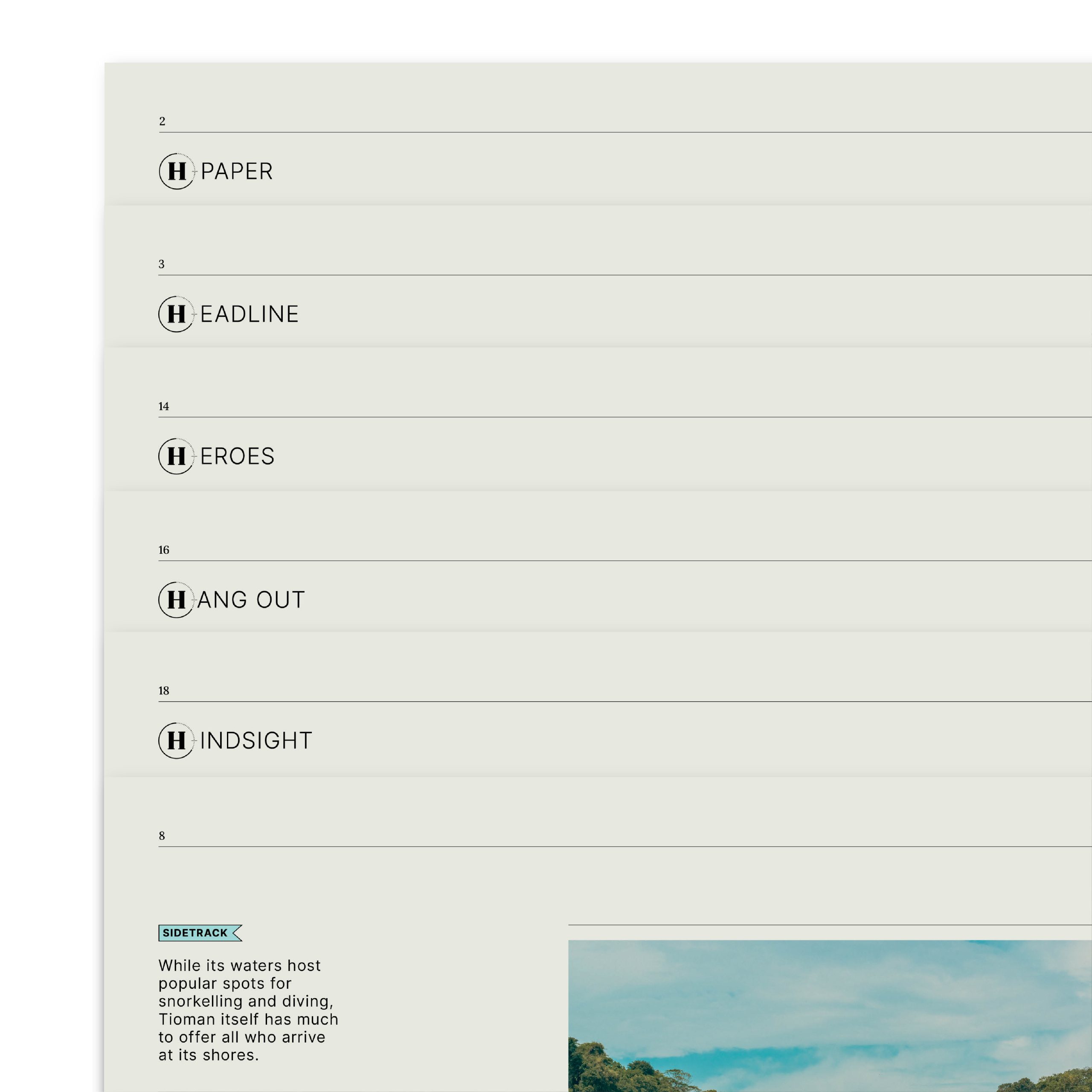
The section headers take reference from the logotype, creating different possible section titles starting with ‘H’. Such as H—ORIZON, H—EORES, H—YPE, H—ABITAT.

Graphic Devices
Derived from the masthead, these graphic devices are utilised to draw the readers’ attention and to add a dash of colour to an otherwise monochromatic publication.

Client: HPL Hotels & Resorts
Creative Director: Kai Yeo
Designer: Marcus Choy
Copywriter: Angela Chew
Photographers: Ernest Goh, Ryan Loh
Project Coordinators: Angeline Loh, Daphne Ting, Jeslyn Lau
Share on Facebook | Twitter | Instagram | Tik Tok
About Us
Byline—Bureau is the official website of Bureau Private Limited. Headquartered in Singapore, our work includes, but is not limited to: Brand Identity Design, Packaging Design, Editorial Design, Exhibition and Event Space Design and Strategic Planning. We think the expression “no sweat” is a hate crime.
Subscribe
Get access to latest news and all the features by subcribing here.
BUREAU OFFICIAL WEBSITE ©2022. BUREAU PTE LTD.
