Bureau is a design studio driven by the promise of purpose and the pursuit of practicality.
Enquiries. Should we be working together? Drop us a call or an email and someone will be in touch!
(Notes on) Selected Works 2009—2024 › Niometrics
Brand Strategy + Identity Design
Niometrics
How should a company—whose raison d’etre is the presentation of data—present its self?
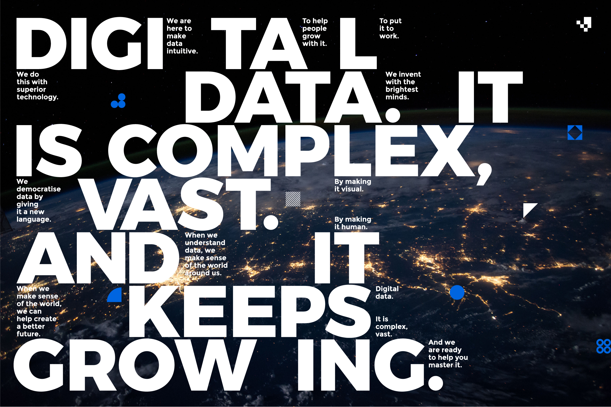
Niometrics sets out to democratise access to vast amounts of digital data by making it simple, useful and easier to navigate. Imagine the possibilities, they do. And they believe that what is possible is no less than the enhancement of human potential.
Harder to understand is how it advances and evolves technology to harness the power of data-rich digital information into useful pieces. And this tension between a clear human mission and work that is harder to understand is at the centre of Bureau’s brand strategy and identity design work for Niometrics.
On the one hand embodying boldness and approachability, much like the mission of the company, and on the other, expressing the sheer volume, velocity and variety of data that Niometrics works with.
At the centre of the brand identity is a piece of generative art—geometric shapes in subdued colours are combined and configured by an autonomous system into an endless unique iterations.

Technology may be the mother tongue, but not everybody understands techspeak. Connecting Niometrics to customers with a constant, uniquely ownable and approachable voice is crucial.
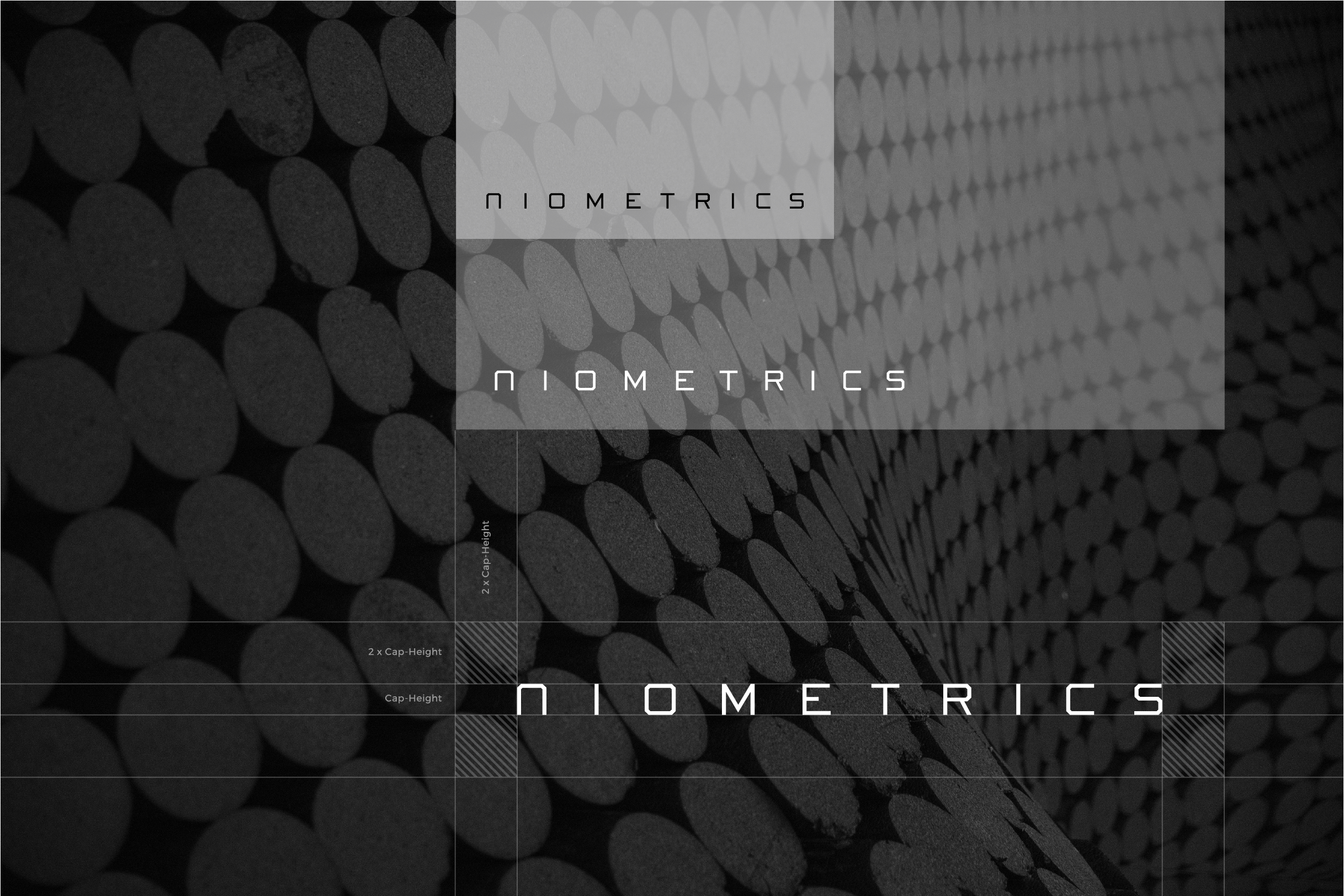
Brandmark
Brandmark as a piece of generative art—geometric shapes in subdued colours are combined and configured by an autonomous system into an endless unique iterations.

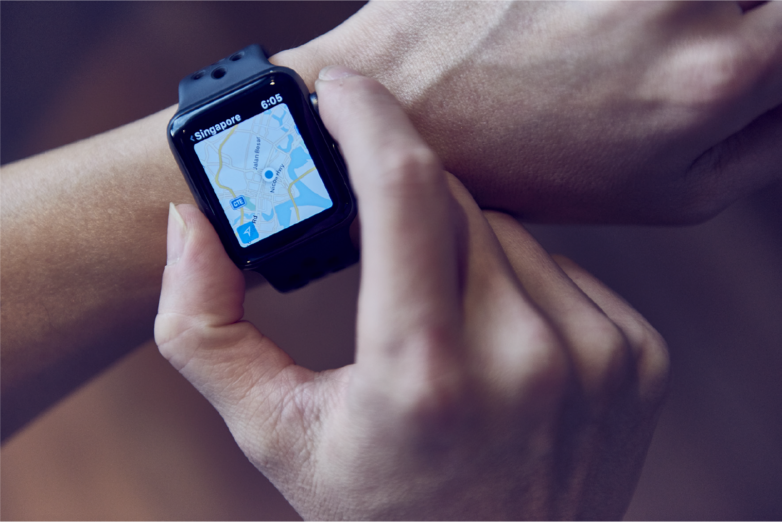
Graphic Elements
Graphic elements visually representing the sheer volume, variety and velocity of data that Niometrics deal with.


Colour Palette
This signature palette exudes a bold statement: Blue inspires confidence intelligence wisdom and credibility. This is complimented by neutrals of White Grey and Black.

Wordmark
The Niometrics wordmark shines most in its simple letterforms. It was designed to stand out even when scaled down like this example on the right.


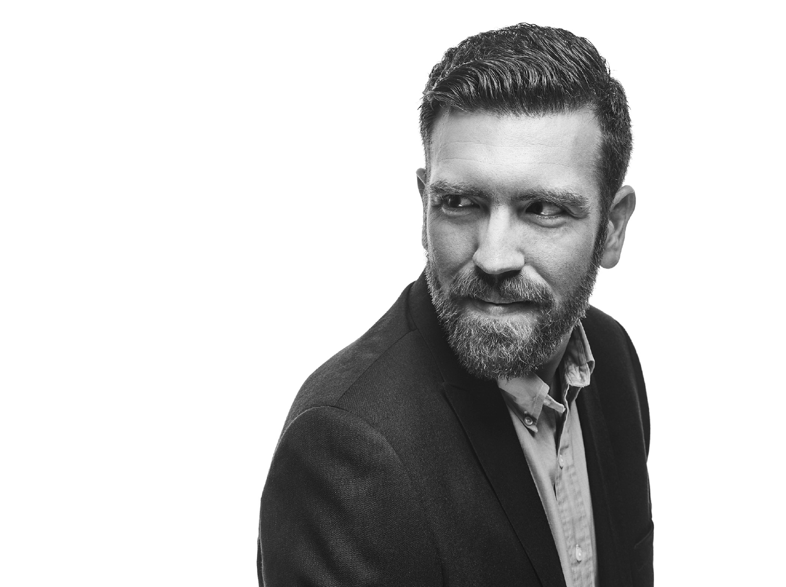
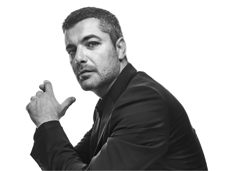
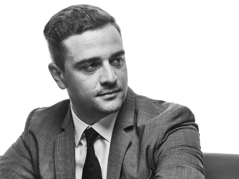
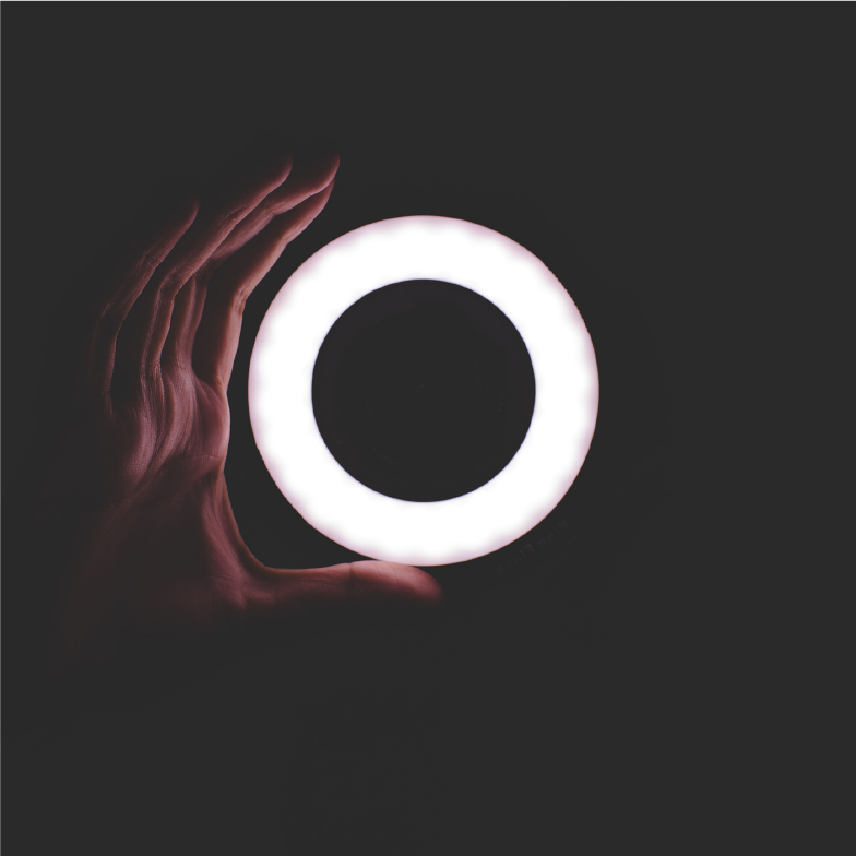
Photography;
Portraiture
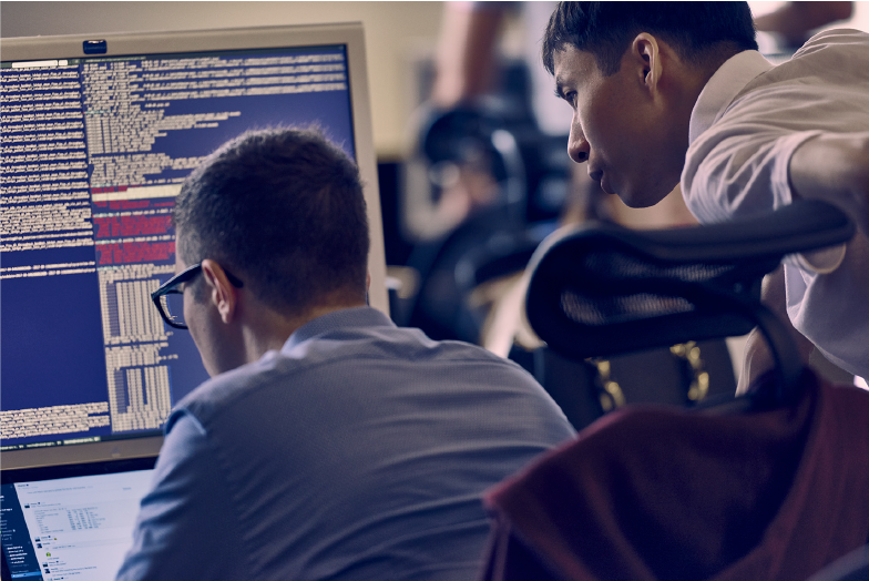
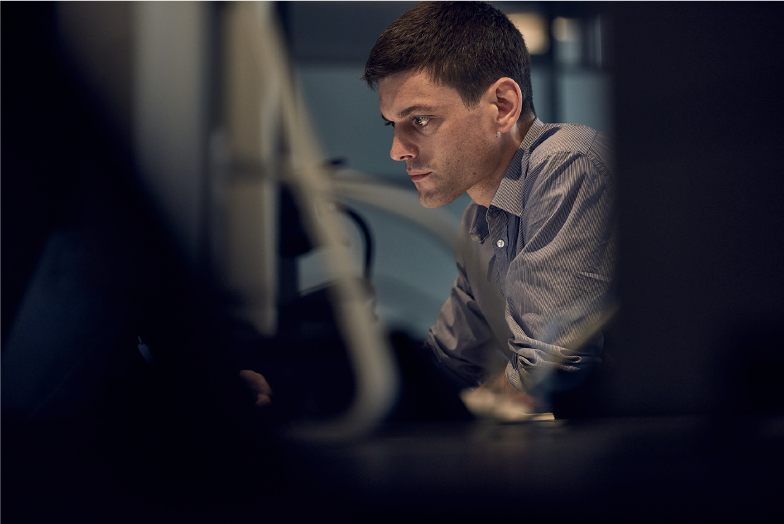
A company of non-conformists and mavericks of their industry who actually do the work. Two sets of images were shot, one with the team in action and another, a series of portraits. The portraits in particular were styled, directed and shot to express dynamism and just enough attitude to express the personalities of the people.


Client: Niometrics
Creative Director: Kai Yeo
Design Lead: Anthony Lew
Strategic Partner: Mabel Tay / Saltus Consulting
Project Coordinators: Marie Brulé / Edmund Seet / Susanna Tan
Copywriters: Daniel Foo / Carolyn Oei
Photographer: Geoff Ang / Geoffstudio
Share on Facebook | Twitter | Instagram | Tik Tok
About Us
Byline—Bureau is the official website of Bureau Private Limited. Headquartered in Singapore, our work includes, but is not limited to: Brand Identity Design, Packaging Design, Editorial Design, Exhibition and Event Space Design and Strategic Planning. We think the expression “no sweat” is a hate crime.
Subscribe
Get access to latest news and all the features by subcribing here.
BUREAU OFFICIAL WEBSITE ©2022. BUREAU PTE LTD.
